
I’m not a designer or UI/UX person by trade, but I have to think a lot about interfaces and design in my work. Here are the 39 things I’ve learned over the years (including illustrative examples) about how to create nice looking interfaces and an effective user experience. (In my own designs I still have plenty of room for improvement along many of these dimensions.)
Keep in mind that even if you don’t do design FOR your work, you may still need to do design IN your work, whether you’re making power point slides, charts, or even just structured word documents. These principles can be helpful for that sort of work too.
39 Principles for Designing Effective Interfaces
Topic 1 – INTENTIONALITY
(1) Define goals – define the most common and important goals that users have when using your product, and think carefully about how they would use your interface to achieve each of those goals. Will it be obvious how you solve those goals using your product? Will it require too much creativity on the part of the user to figure them out? How can you reduce the number of steps it will take the user?
(2) First action – know what you want users to notice first on the page. Confirm with experiments or user interviews that they really do notice that thing first. If they aren’t noticing what you want them to, then make adjustments (by increasing or decreasing emphasis on some elements).
Bad: it is too unclear what the user is supposed to do, and there are too many things for the user to notice


Good: it’s clear to the user what to focus on, and it is clear to them what they should do next

(3) Control focus – draw the users eye where you want them to focus their attention by using differences in size, color, or imagery, contrast, hierarchy or (in special cases) motion. Avoid having an undifferentiated sets of options or items where it is unclear what the most important things to focus on are.
Bad: it’s unclear what tabs are most important or commonly used here and what one should focus on

Good: uses hierarchy and color to focus the user towards more important items (like total expenses) rather than the low level items (like entertainment expenses)

(4) Users first – engineers are often tempted to build things in the way that is easy to program or the natural solution given the technologies being used (e.g. relying on the defaults in their tech stack), but this is sometimes at odds with what will be best and easiest for the users using the thing. Of course the time to develop a feature needs to be taken into account, but don’t allow your technology stack or libraries determine the interface, as it should be determined by the needs of the user.
Bad: the default html styling is very simple for programmers to use but it looks bad

Good: choose styling that makes life easy for the users rather than the programmers

(5) Create delight – look for opportunities to delight the user that go beyond merely satisfying their goal (“I can’t believe how easy that was!”, “That page is so adorable!”, “The interface is so simple yet beautiful!”, “I love the way the items move organically!”, “The visualization really helped me understand what was happening!” etc.)
Bad: the user doesn’t get what they want and is annoyed

Good: even though the user doesn’t get the page they want, and least they are entertained and have a link back to the main page

Topic 2 – DATA
(6) Watch users – ask people to try using the interface while you watch (both new users and experienced ones), and ask them to say everything that comes into their mind out loud (especially confusions or criticisms or things that delight them) as they are using it (but not to ask you questions during the process) so that you can see where they get stuck, what confuses them, what they find annoying, what patterns of usage they have, etc.
(7) Discover needs – it’s critical that you watch people actually use the product, and that you use customer interviews, surveys, dog fooding (i.e. using the product extensively yourself as its initial user), data analytics, and deeply clarity the problem that the product solves, so that you know which features are truly needed. If you start implementing too many features without enough clarity and data to go on you will likely add a lot of extraneous stuff that is cluttering but not that valuable.
(8) Test things – use A/B tests, heat maps, usage tracking, complaint boxes, etc. to test whether a feature is working the way it was intended to or not.
(9) Get feedback – ask the people you know that have the best design sense to give you feedback on what you have so far. Chances are they will notice problems and have ideas for improvements that you would not have thought of. Once we’ve stared at an interface for long enough it’s hard to see it with fresh eyes. What’s more, some people just have an incredible intuition for design (which may have been honed over a decade), and we should leverage their taste if we can.
Topic 3 – CONVENTIONS
(10) Use conventions – if people are used to elements looking or working a certain way (e.g. certain icons have well known meaning, or most people already know how to use certain actions) then stick to those conventions unless you have a strong reason to deviate from them. That’s one less new thing for your users to have to learn. Similar, if people expect certain things to be in a certain place (e.g. site navigation at the top or the login link in the upper right) then you should put it where they expect it unless you have a good reason to deviate from that.
Bad: a non-standard way to represent sending email that users will have to ponder

Good: a more standard and recognizable way to represent sending email

(11) Be consistent – use a consistent aesthetic everywhere. For instance, don’t have the settings page look really different from the other pages, and if you use 3d buttons in some places and flat ones in others, make a decision to just go with one or the other. Don’t have pages that have different color schemes for no good reason, don’t use rounded buttons in some places and rectangle buttons in others without a clear reason to do so. If you use green to mean good then make it mean good everywhere.
Bad: it seems red means bad here but then one would think green means good, yet green is used on warnings and not even all of them

Good: consistent use of colors to signify different types of actions

(12) Reuse solutions – avoid reinventing the wheel. Chances are that whatever design or interface problem you’re facing, others have faced it before. Explore and compare solutions others have come up with for similar problems, and consider which would work best in your situation.
Bad: avoid making up your own unique solutions without looking at how others have solved the problem

Good: look at different options others have come up with

(13) Mobile first – if you are building something where the smartphone use case is important, design the mobile version before designing the web version. Going in the other direction creates major headaches and sometimess means scrapping the web design entirely or having two very different designs. In other words, typically taking the mobile design and “webifying” it is a lot easier than taking the web design and “mobilifying” it.
Bad: adhoc attempt to make the web version work on mobile

Good: mobile first design

Topic 4 – ORGANIZATION
(14) Group things – make sure that things that are related to each other are grouped together. Grouping applies at multiple levels: what page items are on (related items should be on the same page), where they are on the page (related items should be near each other on a page), and how things look (related items should have a related look and feel)
Bad: apparent lack of element grouping, with the eraser between the paintbrush and airbrush, and the bandaid looking tool between two different stamp tools

Good: all the tools related to 3d movement are grouped together

(15) Select order – when you have a list or ordered sequence of things, be mindful of what order they are in. They should never be in a random order (unless you are studying user behavior and don’t want to push the user towards any action). Alphabetical is better than random, but usually one of the worst choices (unless perhaps it’s a contact book). Similar things on the list should usually be grouped together. Also remember that the first couple items in a list tend to be most noticed, and the first item and last item (if people bother to read to the bottom) tend to be most remembered. Adding separation between groups of similar things can make a long list easier to process.
Bad: this list appears to be organized first by time and then alphabetically, which may seem like a reasonable order a priori, but it ends up feeling like a long completely random list when you try to read it

Good: it’s clear here that this is sorted by reactivity, which is the information that the list is trying to convey

(16) De-emphasize inessentials – if information is useful but not the main thing you want to draw attention to, de-emphasize it visually so that it is there if needed but it will not distract.
Bad: the background lines, which are supposed to merely guide your eye, have far too much visual weight and so make it harder to pay attention to the actual information

Good: in this case the gridlines are there if you need them but aren’t distracting

Topic 5 – MINIMALISM
(17) Basics first – before creating a complex, feature rich version, focus on building a simper version with the most essential features that will satisfy the most common use cases.
(18) Pare down – ask yourself what you could remove from the page without hurting the user experience to any significant degree. Then remove it. If it’s unnecessary, it’s probably making things worse.
Bad: sometimes too many options will merely confuse or overwhelm your users

Good: sometimes the best user experience is a really simple one

(19) Limit yourself: early on pick a small number of fonts that plan to use after making sure they look nice together (you can of course always try changing them later). Similarly, limit yourself to just a few sizes of text, a limited palette of colors that look nice together, a small number of interactive components that all look good with each other, etc. When you start allowing yourself too much freedom its easy to end up with something that feels inconsistent or jumbled.
Bad: too many fonts make text jarring and hard to read

Good: these elements were all selected to work well together

(20) Leave space – don’t put items too close together (e.g. text too near a border, or buttons too near each other) as it makes the information harder to process and creates a cramped or claustrophobic feeling
Bad: don’t cram too much stuff together, it makes it hard to read and overwhelming

Good: leave a comfortable amount of room between elements

(21) Reduce text – people generally don’t like reading instructions, and they tend to skim text, so try to reduce the number of words to the bare minimum (while maintaining clarity). Can you replace that paragraph with one sentence without losing the important stuff? Can you replace that sentence with a single word while still having it be understandable? Can you replace that word with an icon while still making it totally obvious what the thing does?
Bad: the same idea could have been expressed using far less text

Good: sometimes you can show a lot of information clearly with very little text

(22) Limit choices – don’t give the user too many choices at a time. Chunk things into smaller pieces. And if the user really does have to make a decision that involves many choices inherently, then try to present these choices in a sensible sequential order (so that the user can focus on each simple part of the decision in isolation) rather than making the user consider all aspects of the decision simultaneously
Bad: too many choices presented at once, it’s hard to know where to start

Good: breaks a complex task into simpler, easy to understand steps

(23) Use defaults – if the vast majority of users are going to want things done a certain way, configure them as defaults so that most users don’t even have to worry about them. Spending extra time to nail the best default settings can save a huge amount of time and effort for your users.
Bad: many users may struggle figuring out reasonable starting settings

Good: provides smart default options based on user goals

(24) Minimize concepts – if you have to teach the user a concept in your app (even a simple one like that toggles are used to turn things on and off), re-use it elsewhere, rather than making them learn yet another concept. For instance, if they learn that they can drag items then try to re-use the idea of dragging for other actions the user takes, rather than having dragging operate in some cases and not in others.
(25) Avoid duplication – don’t have multiple ways to accomplish the same or very similar things. Instead have one clear and obvious way to accomplish each goal. Relatedly, don’t haver two elements that do similar (but distinct things) since users will get them confused with each other. For instance, if you have two types of search bars that you use in slightly different situations users will get confused about when to use each one. In that case, just merge them into a single more powerful search bar.
Bad: avoid solving two related problems in different ways, for instance by having two different search bars with slightly different uses

Good: have just one way to accomplish all related goals, for instance by having a single powerful search bar that you can put any sort of thing into that one might want to search on (e.g. name, model number, date, etc.)

(26) Limit animation – usually animation is more distracting than it is helpful (especially because they powerfully sway the user to look in their direction, which is often not the intended goal). However, sometimes rapid animations when a user takes an action can make an app really pleasing to use. But these animations should illustrate what’s happening, and not slow the user down or cause them to look somewhere other than you want them to be looking.
Bad: image carousels (sliders) that automatically change the images on a page are usually bad because (a) if the user is not currently looking at the slider they will likely be once it animates which will draw their attention from whatever else they were reading or examining, (b) if the user was currently looking at the slider when it changes they might not have finished looking at its previous state

Good: here animation could be great because it could illustrate to the user what will happen physically

Topic 6 – CLARITY
(27) Prioritize – know which actions will be common and which will be rare, and make the common actions easy to do (e.g. by having them already out on the page) while preventing the rare actions from creating too much clutter (e.g. by de-emphasizing them, tucking them away in an advanced panel, or simply not having them in the product)
Bad: treats all options as equally important without any prioritization

Good: makes it clear that these are advanced settings that you are unlikely to need as a beginner or novice user

(28) Provide signposts – if the user is taking a multi-part action then show them where they are in the process (e.g. using a progress bar, or step indicator, or visual representation of the process)
Bad: it says this is “part 1” but doesn’t make it clear how many parts there are, plus part 1 itself seems long and complex and could easily be broken up into smaller simpler steps

Good: makes it clear where in the process we are

(29) Warn directly – don’t wait until a user has filled out a long form to tell them there is “a problem with their input”, tell them immediately after they entered an invalid phone number that there was a problem with the phone number. Warnings should occur whenever there is a substantial chance of error (e.g. if the user inputs are probably not what the user really intended, or if they could lead to severe consequences like the loss of data). Both warning and errors should occur as soon as possible to the mistake being made, and they should be as clear and specific as possible about how the user can fix the problem.
Bad: avoid generic error messages that don’t offer solutions

Good: give clear feedback instantly with an explanation of how to correct the issue (though it could use clearer language than “decimal number” which won’t necessarily make sense to people)

(30) Minimize surprise – avoid violating user expectations (except in the rare cases where you do it purposely to produce an emotional response). Think about what the user would expect to happen in certain situations (e.g. by interviewing users) and then have your product satisfy those expectations. Otherwise, you will find users being confused about why their actions led to such and such results.
Bad: what would you expect to happen if you click that red button? Or is that a tab? Or a multi-part button of some kind? Has it already been selected or is it red to indicate that it’s important or dangerous?

Good: it’s much clearer what “remove” means here. It is obviously a button and it’s fairly obvious what will happen if you click it

(31) Make legible – make sure that all the content is easy to read and see, without a lot of background distractions or poor contrast.
Bad: this text is not easy to read due to low contrast and busy background

Good: the text is very cleanly separated from the background and is supported by images to reinforce meaning

(32) Avoid ambiguity – a user should ideally never feel confused using your interface. It should be immediately obvious what actions can be taken, and what each of them will do.
Bad: it’s unclear whether this second toggle is set to off or disabled (i.e. can I still click on it or not?)

Good: this set of toggles makes it a lot clearer that the grey one is disabled, which is different than being set to off

Topic 7 – STYLE
(33) Get inspiration – before starting, find at least three samples that are related to the over all layout, feel and functionality of your app that you can use as inspiration and to get everyone on the same page about ways that you’ll be similar and different.
Bad:
Why don’t you take a first stab at implementing what we discussed on the phone?
Good:
Here are three websites that are related to what we’re building, with an explanation of how each is similar and different to what we’re doing.
(34) Use examples – when communicating with a designer or engineering team about what an interface should look like, be sure to give them visual examples along with any written descriptions (e.g. explaining the ways the visual examples you are giving are and aren’t what is needed). Too often people try to communicate in just words which alone are not an efficient means of communicating about design
Bad: tries to use text alone to convey what you are saying.
The color scheme is not what we are looking for. We’d like you to try using a color scheme that is a mix of oranges, reds and yellows.
Good: uses imagery to backup the words, which makes them a lot more understandable
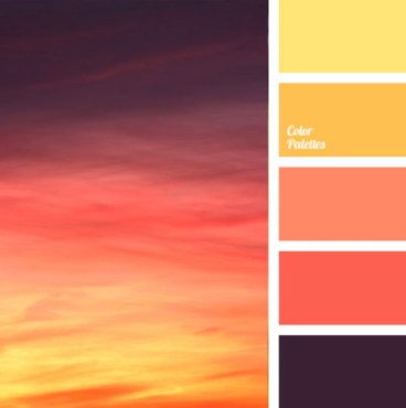
The color scheme is not what we are looking for. We’d like you to try using a color scheme that is a mix of oranges, reds and yellows. For instance, we think this color scheme is a strong choice for our brand:
(35) Stay modern – styles come and go in design. Newer styles are not necessarily improvements in an objective sense (though they sometimes are), and you shouldn’t react to all the latest trends (some are actively harmful to user experience). But that being said, if you fall too out of date in your designs you will start to project an “out of date” brand, which may be harmful.
Bad: this old version of yahoo feels dated at a glance

Good: the new version of yahoo feels more in line with modern practices and expectations

(36) Align elements – when things are out of alignment it feels discordant, whereas when they are nicely aligned its pleasing to the eye and makes it easier to scan information
Bad: elements don’t line up with each other

Good: elements are pleasingly aligned

(37) Match colors: some sets of colors simply tend to look more pleasing to the human eye than others (whether this is cultural phenomenon or a biological one or a mix I’m not sure). While a master can subvert these color guidelines (just like a master musician can break the rules of music theory), its good to stick to generally pleasing color palettes as a starting point.
Bad: this color palette will tend to look awkward to most people

Good: this color palette will tend to look nice

(38) Project style – know what kind of brand you are trying to project, and be sure that your designs support it. Are you trying to say that your product is friendly, modern, cute, simple, cutting edge, tech savvy or something else? Know what you want to say to your user and get that message across. Make sure to have complete consistency in the message you are trying to get across (as inconsistency may make users with that you’re faking it).
Bad: this website design feels like it’s trying to project the idea of innovation or technology (e.g. with the gears and stripes) but it doesn’t feel genuine

Good: this brand is based on the idea of being simple, and it projects that effectively

(39) Violate consciously – while the rules here chosen because they are useful rules of thumb, there is a time and place to violate each and every one them. These are not laws, only suggestions for what usually works. However, when you violate rules of thumb you should ideally do so while conscious that you are violating one, and have a specific reason for doing so. As with many fields, it’s often best to master the rules of thumb before you start violating them.
Bad: this website violates rules but not in a thoughtful way that works to its advantage

Good: this designer’s website violates the rules for what we think of as a personal website, since it consists only of a beautiful, interactive chat bot interface, which illustrates by example the kind of design+code work he does

Comments